After years of division between Ultra and standard Galaxy S models, the upcoming S26 Ultra will finally adopt a design that unifies the lineup, moving away from its Galaxy Note-inspired identity.
Unified design revealed through One UI leak
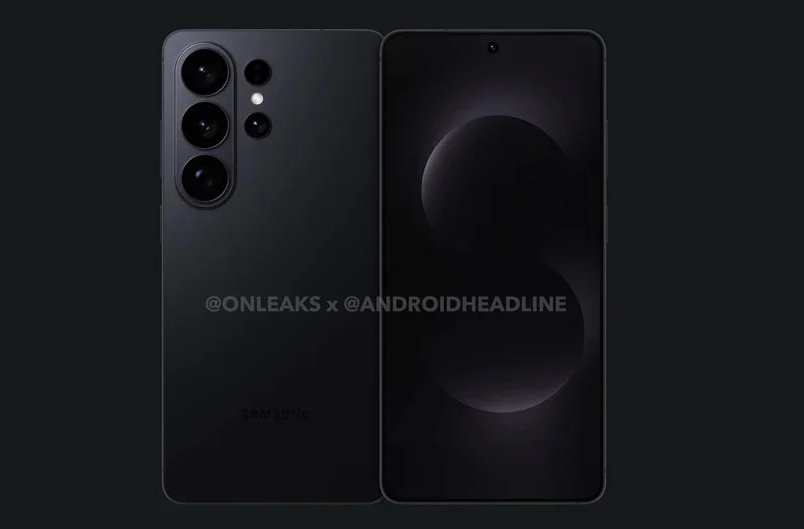
According to PhoneArena, Samsung may have accidentally leaked the design of the Galaxy S26 series through One UI 8.5 system files. The images uncovered in the update - linked to codenames M1, M2, and M3 (corresponding to the S26, S26 Plus, and S26 Ultra) - suggest that all three devices will share a consistent look.
In previous years, the design of Samsung’s S series had lacked cohesion. While the base and Plus models featured softly curved edges and distinct camera islands, the Ultra variant retained the sharp, angular styling of the Galaxy Note series with floating camera lenses - setting it apart visually.
But those days are over.
Leaked renders suggest that the S26 Ultra will now feature a vertical camera array within a dedicated island, much like the smaller S26 and S26 Plus. The only differences will be in the placement of extra sensors.
Though subtle, this shift is significant. For the first time in years, the Ultra will look like a true member of the Galaxy S family.
A strategic design decision
In the world of smartphones, design consistency is a constant challenge.
On one hand, a $1,200 flagship needs to stand out from a $300 budget device. On the other, a unified “face” across product lines strengthens brand identity and recognizability.
Samsung’s past strategy lacked this cohesion. The S24 and S24 Plus looked like siblings, while the S24 Ultra seemed like a distant cousin from the Note universe.
Now, by unifying the camera island design across the S26 lineup, Samsung is following a path long taken by Apple and Google - but in its own way.
Apple maintains visual harmony across iPhones. The iPhone 17 Pro may have a massive camera module, but it still reflects the same design DNA as the base model.
Google’s Pixel series does the same with its visor-style camera bar, making the Pixel instantly recognizable, whether it’s the flagship or an entry-level 9a.
This shift raises a fair concern: will making the Ultra look like a Galaxy A-series phone dilute its premium appeal?
But there’s another way to look at it - visual consistency can be more powerful than specs alone in building a strong brand identity.
Why design unity matters
Some loyal fans of the Galaxy Note aesthetic may resist the change. But a flagship lineup that looks like it was designed by three different teams simply doesn’t reflect well on a global brand.
A product family should look like a family.
Placed side by side, the Galaxy S26, S26 Plus, and S26 Ultra should resemble small, medium, and large interpretations of the same design vision - not three unrelated devices.
The new vertical camera island delivers a clean, coherent look that Samsung has been missing for years.
Of course, concerns about the Ultra feeling “less special” are valid. But true differentiation doesn't have to come from shape or camera layout.
It should come from the materials, the display tech, the hardware, and the overall premium experience.
A device crafted from titanium and glass, like the S26 Ultra, will still feel worlds apart from a plastic-bodied Galaxy A phone - starting from the moment you hold it.
A mature design for a mature brand
Ultimately, this design unification reflects Samsung’s confidence.
This is what a Samsung flagship looks like.
After years of clinging to the Note design as a legacy, Samsung seems ready to bring the Ultra fully into the Galaxy S fold.
If the leaks are accurate, the Galaxy S26 Ultra won’t just look different - it will signal a new, deliberate, and more mature design direction.
This is exactly the kind of identity Samsung needs to stay competitive and memorable in today’s saturated smartphone market.
Hai Phong